
Stunning visual design often feels like a hidden art form, one that can seem intimidating to get right. Did you know the duotone effect is an innovative technique creating waves in the world of design? This blog guides you through understanding and harnessing this powerful tool for your project, transforming your work into a visual masterpiece.
Ready to elevate your designs? Let’s get started!
Key Takeaways
- Duotone design is a technique that uses two contrasting colors to create visually striking images.
- The history of duotones dates back to the early years of print photography and has evolved with advancements in technology.
- Duotone designs have versatile applications, including web graphics, hero images, backgrounds, and illustrations. They enhance visual interest and impact in projects.
- Tips for creating stunning duotone designs include choosing colors wisely, pairing with solid colors and white, thinking beyond photography, and creating the right tone.
- Pixlr’s duotone effect is a powerful tool that allows designers to easily create unique and eye – catching visuals. It enhances social media presence and offers popular features for editing.
The Duotone Effect: Definition and History
Duotone design refers to the use of two contrasting colors to create visually striking images, and it has a rich history dating back to the early days of printing.
What is duotone design?
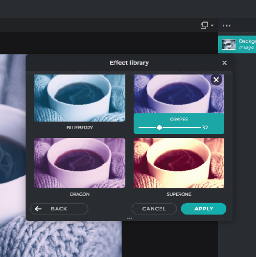
Duotone design is a popular design technique, known for creating powerful visual impact with just two colors. It involves the blending of two different shades on an image to produce distinct yet harmonious results that are eye-catching and engaging.
Originating from printing where only two ink colors were used, duotone has made its way into digital design, becoming widely used in everything from website designs to branding and advertising materials.
Its beauty lies in its simplicity and versatility – it’s easy to implement but can create dramatic effects that elevate the overall aesthetic appeal of your project.
The history of duotones
Duotones have a fascinating history that dates back to the early years of print photography. In the 19th century, duotone printing was used as a cost-effective way to reproduce photographs in newspapers and magazines.
Originally, duotones were created by combining two contrasting colors, such as black and another color, to produce a distinctive visual effect. This technique gained popularity due to its ability to add depth and interest to images.
During the 20th century, advancements in technology made it easier for designers to create duotones. With the development of software like Photoshop, designers could manipulate colors and tones more precisely, resulting in even more striking effects.
Today, duotone design keeps changing with new techniques and tools that allow designers to experiment with different color combinations and effects.
Applications and Benefits of the Duotone Effect
Duotone treatments have many applications in design, from web designers building striking hero images and headers with them to using them as backgrounds that add visual interest and impact to a page.
Different uses of duotones in design
Duotones are popular in design because they are versatile and visually striking. Reducing an image to two contrasting colors gives web designers a quick way to make hero images and headers stand out, often serving as the first thing a visitor notices on a page.
Backgrounds are another common application. A duotone background gives a site a consistent, considered look without pulling focus from the content placed on top of it. Graphic designers use the same technique outside of web work, applying duotones to make a design stand apart from flat, full-color alternatives.
The common thread is the color reduction itself: cutting a photo or illustration down to two contrasting tones creates a dramatic look that grabs attention and tends to stick in a viewer’s memory longer than a plain, full-color image.
Enhancing visual interest and impact
Stripping an image back to two colors forces a stronger visual hierarchy: shapes and shadows read more clearly, and the composition feels more deliberate. That is what makes the duotone effect useful for web graphics, hero images, and backgrounds alike — the visuals carry more weight without needing more detail.
The choice of colors, and how they are paired, does most of the work. Careful selection and creative combinations give a design a distinctive character, while the wrong pairing can fall flat — so it is worth testing a few options before settling on one.
Experimenting with different color palettes and techniques is the best way to find the combination that delivers the visual impact a piece of artwork or a design project is aiming for.
Tips for Creating Stunning Duotone Designs
Choose colors wisely, pair with solid colors and white, think beyond photography, and create the right tone to achieve visually impactful duotone designs.
Choosing colors wisely
Choose your colors wisely when creating duotone designs. The right color combination can make or break the overall impact of your design. Consider contrasting colors that complement each other and create a visually pleasing effect.
Experiment with different shades, tones, and hues to achieve the desired look and feel. Don’t be afraid to think outside the box and try unexpected color combinations for a creative twist.
By selecting your colors carefully, you can enhance the visual interest and impact of your duotone designs.
Pairing with solid colors and white
Pairing duotone designs with solid colors and white can create a striking visual impact. By using solid colors as the background or in combination with the duotone effect, designers can enhance contrast and make the images stand out even more.
The simplicity of solid colors and white allows the duotone elements to take center stage, resulting in visually pleasing and dramatic designs. This technique adds a creative twist to the overall composition and helps convey a message effectively, making it an excellent choice for web designers, graphic designers, and anyone looking to create visually stunning designs.
Thinking beyond photography
Exploring the possibilities of the duotone effect goes beyond just using it with photography. Designers can think beyond traditional imagery and experiment with applying this technique to various elements such as illustrations, icons, graphics, or even typography.
By thinking outside the box and pushing the boundaries of how duotones are typically used, designers have the opportunity to create unique and visually compelling designs that capture attention and leave a lasting impression on viewers.
So don’t be afraid to get creative and explore new ways to incorporate the duotone effect into your design projects.
Creating the right tone
To create stunning duotone designs, it is essential to choose the right tone. The choice of tone sets the mood and atmosphere of the design. Whether you want a bold and edgy look or a softer and more subdued feel, selecting the appropriate tones is key.
Experiment with different color combinations to achieve the desired effect. Remember, the goal is to create a visually pleasing design that captures attention and leaves a lasting impression on viewers.
So take your time in finding that perfect balance of colors to evoke the desired emotions in your audience.
In addition to choosing the right tones, consider how they interact with each other within the design. Pay attention to contrast – by using light and dark shades together, you can create a dramatic effect that demands attention.
Using Duotone Effects in Design Tools
Using Pixlr‘s duotone effect is a straightforward way to add a creative twist to your designs and your social media graphics. Here’s a closer look at how the effect works, where it fits, and which Pixlr features support it.
Below are practical tips and techniques for putting the duotone effect to use in your own visual compositions.
Utilizing Pixlr’s duotone effect
Pixlr’s duotone effect works by applying two contrasting colors to an image in place of its full color range. The result is a stripped-down, high-contrast look that reads as deliberate and designed rather than accidental.
You can apply it to a social media post or to a website header, and in each case you’re free to test different color pairings until you land on a combination that fits the mood you’re going for — from a visually pleasing, subdued pairing to a much more dramatic one.
Because the tool is simple to operate, it doesn’t take much time to try out several color combinations before settling on one. That makes it worth experimenting with on a range of projects, not just a single hero image.
Adding a creative twist to designs
The duotone effect is one of the more direct ways to give a design a distinct visual identity. Because it limits a composition to two colors, it forces clearer contrast and a bolder, more graphic look than a full-color image typically has.
Web designers can use it to make a hero image stand out, while graphic designers can apply it more broadly as a stylistic device across a project. In both cases, the reduced palette is what creates the artistic effect — the fewer colors involved, the more each one has to do.
It’s worth trying a range of color palettes rather than defaulting to the first pairing that looks decent, since different combinations change the tone of the same image considerably.
Enhancing social media presence and designs
On social media, the duotone effect gives graphics a more consistent, considered look, which helps posts stand out in a feed and hold a viewer’s attention for a moment longer.
It works well in profile pictures, cover photos, and as a background behind text overlays, since the simplified color scheme keeps the image from competing with the text sitting on top of it.
Choosing color combinations that match your brand’s existing palette helps keep the look consistent from one platform to another, so posts on different channels still feel like they belong to the same account.
The effect also gives social graphics a more polished, professional feel. Cutting the color palette down doesn’t reduce visual interest — it concentrates it, since there are fewer colors competing for attention.
With a narrower palette, the elements you do want to highlight stand out more clearly. Paired with deliberate typography choices or subtle gradients, the duotone effect can pull an entire post together into a single cohesive composition.
Exploring popular features from Pixlr
Beyond the duotone effect itself, Pixlr includes several features aimed at refining a design once the base color treatment is in place, and at testing different color combinations before committing to one.
For both visual design and graphic design work, Pixlr’s tools let you adjust colors, highlights, shadows, and contrast, giving you finer control over how the final image reads.
Pixlr also includes basic correction options for video editing, so the same reduced-color, high-contrast approach used in still images can be carried over into video work as well.
Conclusion
The duotone effect has become a practical way to add visual interest to a design with a limited color palette. By narrowing the palette to two contrasting colors, duotones give an image a dramatic, distinctive look that a full-color photo often can’t match.
With tools like Pixlr, designers can add this effect to their own work without much extra effort, giving social posts and other visuals a more striking, cohesive style. Used well, duotones are a simple way to make ordinary designs stand out.
(Image credit: Pixlr)
Frequently Asked Questions
1. What is the duotone effect in design?
The duotone effect is a design technique where two colors are used to enhance visual aesthetics, creating breathtaking visual masterpieces.
2. How does the duotone effect help in creating visual masterpieces?
The duotone effect uses contrasting hues for highlights and shadows, adding depth and dimension to images thus transforming them into stunning visual masterpieces.
3. Can I use the duotone effect on any image?
Yes! The beauty of the duotone effect lies in its versatility; it can be applied to almost any image to transform it into a dynamic piece of art.
4. Is using a Duotone Effect difficult?
Not at all! Once you understand this design technique, it offers an easy way to create dramatic changes that greatly enrich your work’s overall aesthetic impact.

- Independent picks for exactly what you just read about
- Matched to your team size & needs
- Vendors don't pay for placement
Step 1 of 4
How big is your team?
We tailor recommendations to companies your size.













Related Articles

Employee Engagement
How to Improve Company Culture: Actionable Tips for a Stronger Workplace
Continue reading →

Best Tools
Best Employee Engagement Software in 2026: Top Platforms to Improve Culture and Retention
Continue reading →

Employee Engagement
Best Employee Engagement Software in 2026: How to Choose the Best Employee Engagement Tools
Continue reading →

Employee Engagement
PerkSpot Review 2026: Is It Really the Leading Employee Discount Platform?
Continue reading →